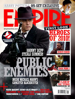
I wanted to see if a different film magazine would use a different print layout;
The Magazine title is behind the image as the magazine is well established. It is bright red, and this may be as the featured film public enemies is quite gory in terms of blood and shooting so thecolour red may have been used to symbolize this.
There is a banner across the top of the magazine promoting the new harry potter, together with a small circle shaped picture.
A white long rectangular box the reader have a sneak peak at new films, The colour scheme appears to be white and red, throughout the cover.
*So we will need to define our colour scheme- I'm thinking yellow and green something bright for a comedy!*
The main title and picture are slightly to the left of the page unlike the total film poster where it dominated the majority of the page. The background of the page is also part of the main image, however it is blurred so the focus is on the main picture!
Have you (or someone in your group) got more detailed analysis of magazine front covers? you need to look at layout and design as well as content and compare different styles.
ReplyDelete