Monday, 2 November 2009

Filmed!

We had lots of fun whilst filming and were very efficient when filming. We wasted no time as we had planned everything, mwe have used multiple shots such as tilt, two way shots, zooming, close-ups, medium and long shots, and also panning.
We are very pleased with what we have filmed and are very excited to start editing.

Thursday, 22 October 2009


This is our first attempt at a magazine cover, we have tried to create our own template by following the conventions we found in other magazine covers.We tried to keep it colourful with a bold image and eye catching writing!

Filming

we are starting filming over the next week, it shouldn't take two long as our storyboard was very clear, and we know what we are doing! The majority of shots will only be around 2-3 seconds long.

Friday, 9 October 2009

trailers through time

Some like it hot is a classic film, that has a similar plot line to our project, as it is one of my favourite films anyway, i thought it would be a good idea to see how trailers have changed through time, and what effect this has on an audience;

Similarities

There are still similar codes and conventions used in a trailer from the 50's to a high tech, high budget trailer today in the 21st century such as;

* A deep voiced man speaking the voice over throughout the trailer, although rather then asking the audience rhetorical questions to get them thinking about the film stirring their interest, he merely speaks of the actors/actresses and their characters e.g - to be found

* Lots of different shots, to keep the audience attracted

* Use the songs in the film over the trailer, remixed into one long song


Differences

* The trailer is very long nearly running for two and half minutes, whereas now a minute or under is more effective and if showing the appealing content and music will attract the audience even more

* There is an advertisement for a Marilyn Monroe c.d in the middle of the trailer which is promoting her singing which would attract audiences in 50's for her voice, as they would realize she would be singing in the film, however now days music career's and acting career's are two separate things, so linking the two would maybe confuse a modern audience?

My survey!

I thought it would be a good idea to carry out a survey to see what our audience wants from a rom-com!

1. What do you like to see in a comedy?
-Funny outfits-0
-Silly jokes -10
-Cool locations-0

The results for the first question are a 100%  for silly jokes!! No-one voted  for any other answer so it is easy for us now as we know we need to focus on creating good jokes!

2. Which title do you think is the most effective?
-The Set Up-6
-The Mistake-1
-Candice-3

Although there are multiple votes for each answer, The Set Up has the most votes and we as a group also feel this is the strongest title as it is short sharp and memorable.

3. When reading about a film do you prefer?
- A film review-5
-A interview with the actors-5
-Information about the DVD-0

As the votes are tied between a film review and an interview I think we should put both on the front cover of the film magazine as to indicate what would/could be inside.

4. What is more important to you locations or content?

-Locations - 0
-Content - 10

As content has won all the votes for the votes for this question, we are really going to have to work on the short clips of dialogue that will be present in the trailer. We are going to have to get across good jokes and show the audience how good the storyline is without giving everything away!

5. Which Magazine title do you prefer?
-Film Weekly- 4
-Come on Comedy-4
-Comedy weekly - 2

Although Film weekly and Come on comedy have the same number of votes, we have decided to use Film Weekly as there aren't enough comedies produced monthly to make a comedy magazine! So we are using Film Weekly!

Wednesday, 7 October 2009

Magazine Cover Draft


I experimented on paper first what I thought would look good for our magazine cover.
We would like our picture to fill the whole background of the page.
We are going to put other feature of up and coming films!
I am going to carry out a survey on what prices our audience would think acceptable for a magazine.

Friday, 2 October 2009


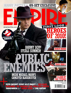
I wanted to see if a different film magazine would use a different print layout;
The Magazine title is behind the image as the magazine is well established. It is bright red, and this may be as the featured film public enemies is quite gory in terms of blood and shooting so thecolour red may have been used to symbolize this.
There is a banner across the top of the magazine promoting the new harry potter, together with a small circle shaped picture.
A white long rectangular box the reader have a sneak peak at new films, The colour scheme appears to be white and red, throughout the cover.
*So we will need to define our colour scheme- I'm thinking yellow and green something bright for a comedy!*
The main title and picture are slightly to the left of the page unlike the total film poster where it dominated the majority of the page. The background of the page is also part of the main image, however it is blurred so the focus is on the main picture!